Color Theory

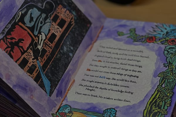
Pages from my book Testament

Learning color theory is, of course, a fundamental thing we all are either taught or stumble through as we figure ourselves out as artists. It’s also something that underpins how many humans interact with the world, just subconsciously. All that being said, I don’t think I really appreciated it until I encountered two texts that utilized visual cues in a very specific way to convey additional information.

One was Burning Empires, a table top roleplaying game designed and published by my friend Luke. During his development of it and well after, we talked about how he utilized visual cues in the book as a way to denote place and relative importance of the content. To this day, I think it is a fantastic example of utilizing layout as an intentional part of communication design in RPGs and doesn’t get enough credit.

Either way, that was one of the strings that got me down a specific path for Testament. The other was House of Leaves, by Mark Danielewski, in which he leverages colored text (in certain versions of the book) as a sort of chroma cue. I chose to adopt both methods, but aligned to specific themes that aren’t necessarily apparent at first glance.

The first is using several chroma cues on the text, in which there are specific characters that have color in their name, acting as a sort of guidepost. Words that are interrelated in the mythology of the work are tied together with colors. The colors have meaning, and even if it isn’t explicit, it subconsciously informs the reader that this “thing” is connected to that other “thing.”
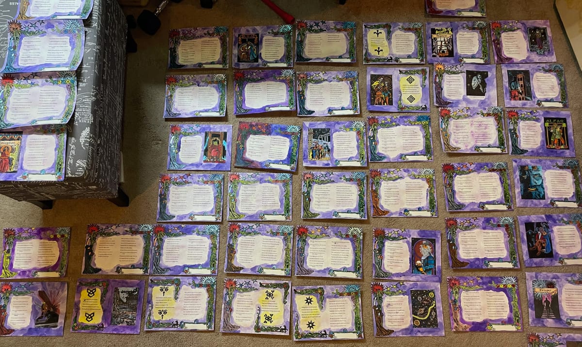
Building on that, color is used in the same way in the painting of the linocut draws and in the hand illustrations in the margins. This helped me tie together multiple themes across multiple styles of blocks and illustrations. The goal of the work, after all, was to create a crafted item of intention, where color, art, layout, and text work together to convey ideas, not to different from great comics.

, ,